When I built the first version of Compton’s Hardware Store for the Design for Web Content module, I wrote about the thinking behind those decisions in my earlier design process post. Coming back it, gave me the chance to implement what needed to be improved. This post covers what I found wrong with the original site, and everything I changed to fix it.
Part 1: Critical Analysis of the Original Site
Maintainability
The biggest problem with the original site was that the header, navigation, and footer were copy-pasted identically across all four HTML pages. Changing something as small as the phone number would have meant editing it in four separate files. It also caused a real content bug: from the earliest planning stage, the business was built around a father-and-son identity, Harold and Alex, right down to the logo, which is a silhouette of the two of them holding a shovel and a hammer. Despite that, the homepage and products page both called the owners “Compton and Jake” instead, while only the About Us page had it right. Nobody caught it because there was no single place the name lived. That’s exactly the kind of inconsistency copy-pasted markup invites.
Accessibility
The mobile navigation menu was built using a hidden checkbox and a label styled to look like a hamburger button. The problem is that a checkbox hidden with display: none is removed from the keyboard tab order entirely, which meant keyboard-only users could not open the mobile menu at all. There was no skip-to-content link, no visible focus outline on the navigation links, and the embedded Google Map had no title attribute, so a screen reader would just announce “iframe” with no context. Alt text was present on most images but inconsistent in quality, including at least one typo.
Missing functionality
The brief asked for a custom 404 page, a well-considered use of JavaScript, and an accessibility statement. The original site had none of these. There was no JavaScript anywhere on the site, which also meant no dynamic “is the shop open right now” feature, despite the store having clearly defined opening hours.
SEO
None of the four pages had a meta description, which matters because search engines display it directly on the results page. There was no structured data of any kind, and the checklist’s specific note to “not forget geolocation” wasn’t addressed at all. Opening hours were written as plain paragraph text rather than anything machine-readable.
What was already working
To be fair to my past self, some things held up. As I wrote about in my original design process post, the colour palette (green #1A4D2E, dark green #0F3820, brown #8B6F47, dark orange #D68438, and off-white #F7F5F1) and the typography pairing (Playfair Display for headings, Lora for body text) were deliberate choices grounded in the brand values of trust, family, and experience, not arbitrary ones, and they still read that way in the finished site. The CSS was genuinely mobile-first with sensible breakpoints, a Meyer reset was in place, aria-current="page" was used correctly for the active nav state, and images were already served as WebP rather than uncompressed JPEGs.
Part 2: Summary of Improvements
Technical rebuild
The rebuild starts with PHP Server Side Includes for the header, navigation, and footer, which immediately solves the maintainability problem and restores the correct Harold and Alex identity everywhere, since the name now only exists in one place instead of being retyped, and occasionally mistyped, on every page. Each page sets its own $title and $descr variables before including a shared head.inc.php, which gives every page a unique, search-engine-friendly title and meta description without duplicating the rest of the <head>..
The broken checkbox navigation was rebuilt as a real <button> with aria-expanded, toggled with a small JavaScript file, which restores full keyboard access. I added a skip-to-content link, visible focus states throughout, a proper title on the map iframe, and an <address> element for the store location instead of plain paragraphs.
For the JavaScript requirement, the site now shows a live “Open now, closes at 7pm” or “Closed now, opens at 9am” badge on the Find Us page, calculated from the same central hours data, plus a time-of-day greeting on the homepage (“Good afternoon! Welcome to Compton’s Hardware Store”).
Finally, I ran the rebuilt site’s actual HTML through the W3C validator engine rather than assuming it was clean. It caught two real issues I’d introduced myself: the opening-hours list was using <time datetime="Mo"> for weekday names, which isn’t a valid datetime format, and the homepage briefly skipped from an <h2> straight to an <h4>, missing a heading level. Both are fixed now, which is a good reminder that validating isn’t just a box to tick at the end, it catches real mistakes.
Design direction
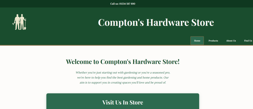
The visual design went through more iteration than the technical build did, which was a useful lesson in itself. I started by researching how similar retailers present themselves, looking at Screwfix, B&Q, Wickes, and IKEA for how trade-focused sites use bold colour and grids, and at a more boutique gardening brand for softer, editorial layouts. My first full design pass leaned into that softer, editorial direction: a dark, muted palette with a serif display face. Looking at it properly, it didn’t feel right. Compton’s is run by two men, and a delicate, boutique aesthetic didn’t reflect that honestly.
Old Design
New Design
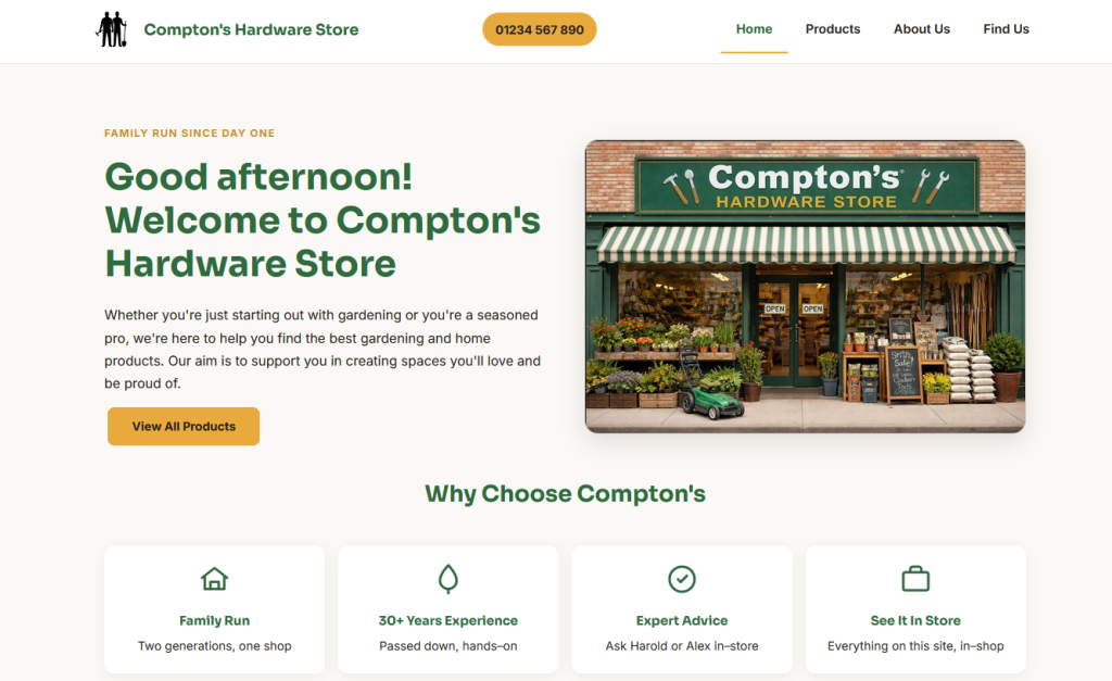
The final design keeps the “less boxy, more considered” quality I was after, but grounds it in something closer to workwear than lifestyle magazine: a confident fern green paired with a burnt marigold accent, rounded white product cards with sale and new badges (closer to how Screwfix and B&Q actually present deals), and a bold geometric typeface (Sora for headings, Inter for body text) instead of a soft serif. The navigation was simplified from a bulky three-bar header down to a single slim bar. I also removed every instance of text overlaid on photographs once I realised how often it hurt readability, in favour of images and text sitting cleanly side by side.
What I’d do differently next time
I’d test the navigation with a keyboard on day one next time, rather than only during the accessibility pass, since that single checkbox-based menu turned out to be the most serious usability bug in the entire original site, and it would have taken thirty seconds to catch.
References
Web Content Accessibility Guidelines (WCAG) 2.1
Screwfix, B&Q, Wickes, and IKEA (competitor research for layout, colour, and product presentation)