Categories
Uncategorized

3 Websites with good colour schemes

https://www.frame.io

Background: Deep Navy with purple and blue highlights

Text: White and Soft grey

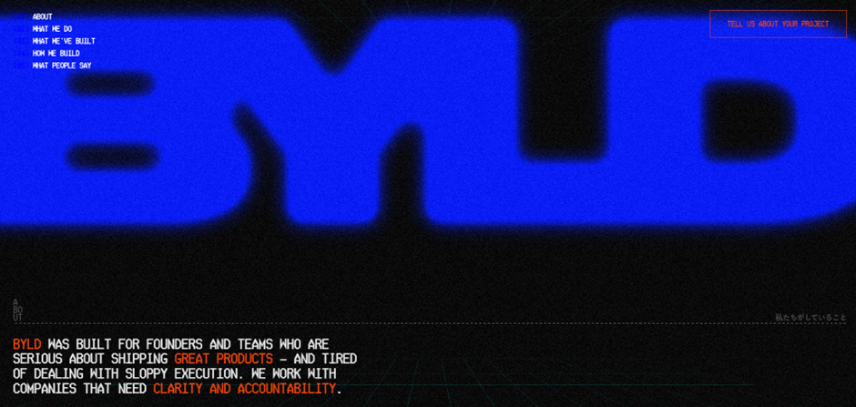
Framer io’s colour scheme creates an exciting and modern visual experience through its deep navy background with purple and light blue highlights. The combination of white and soft grey text against the dark background gives the website good contrast, making it easy to read while giving it a clean and professional look. What stands out most is how the cool blue gradients give it a modern look, while the subtle purple tones give it a creative and futuristic look.

The palette doesn’t just look good, it also influences how we feel. Blue evokes trust and calmness. Purple suggests forward-thinking and the dark background adds sophistication. The gradient between the black and purple gives that futuristic feel so you excited going through the website.

https://orkenworld.com

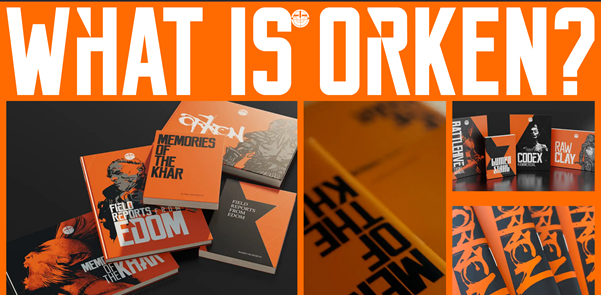
Background: Orange, Black and dark grey

Text: White

ORKEN’s website (orkenworld.com) features a dark, moody colour scheme that creates an immersive and atmospheric experience, perfectly suited to its fantasy theme. The primary background is a near-black shade, providing high contrast for light text elements, which are typically in a soft grey text for readability. The website also incorporates a vibrant orange, which highlights the brand’s fantastical aesthetic. The overall palette is restrained but effective: the dark base sets a dramatic tone, the light text ensures clarity, and the metallic and orange accents provide visual interest and focus. This combination guides the user’s eye, emphasises interactive parts, and supports the storytelling.
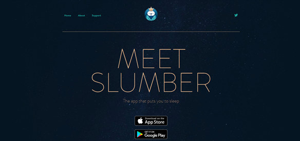
https://slumber.fm

Background: Navy

Text: Gold

Slumber’s website uses a calm, dark colour scheme that fits its focus on relaxation and sleep. The background is a deep navy, and the text is light grey or off-white so it’s easy to read. Soft teal and green-blue accents add a gentle, soothing touch without being distracting. The colours are simple: the dark background adds depth, the light text is clear, and the muted accents guide the eye. This makes the site feel peaceful while keeping buttons and links easy to see. The colours also remind you of the night sky, which feels familiar and helps connect the design to sleep.

Categories
Homework

3 Websites With Good Typograghy

  1. Pact Media

https://pactmedia.org/

Pact Media is a full-service creative agency that helps brands stand out and deliver meaningful digital experiences. Right from the homepage, you can see their design identity shine through. It gives confident, stylish, and progressive.

The headings use the Felix serif font, which immediately gives them presence. It feels bold and confident, yet still stylish, perfectly reflecting the agency’s creative personality. The elegant but yet sharp details at the ends of letters adds sophistication, showing that Pact Media values both professionalism and creativity. It’s the kind of font that really communicates what the agency can bring to its clients.

For the paragraphs, navigation, and other text, the site uses Exo, a clean sans-serif font. Exo is easy to read, geometric, and slightly boxy. It’s clear to see that box shape when you look at the o’s, e and a.

It pairs beautifully with Felix, balancing the decorative heading with simple, readable text. Plus, there’s good line spacing making the content easy on the eyes and effortless to skim through.


2. Pixelmatters

https://www.pixelmatters.com

Pixelmatters is a digital product studio founded in Porto, Portugal, around 2013–2014. Their team is made up of strategists, designers, and developers who work together to create high-quality web and mobile experiences. Guided by their motto, Good is not good enough, Pixelmatters places a strong focus on excellence and detail in everything they build.

The website uses Geist Sans, a clean sans-serif typeface that immediately gives a sense of trust and reliability. The circular shapes of letters like p, d, b, and c create a soft and smooth appearance, making the text feel approachable and friendly. Despite its simplicity, the font also feels modern.


3. BYLD

https://www.byld.dev

byld.dev is the website for BYLD, a software agency that helps founders and teams create exceptional digital products. Their goal is to build software that businesses can trust and rely on. The site has received awards for its design, winning Best Innovation, UX, and UI at the CSS Design Awards in 2025.

The title font, Microgramma D, is known for being strikingly bold. It acts as a strong visual element for the website, immediately drawing attention. Though the designer chose to merge the letters, the boldness of this font ensures the name remains clear and readable even with the creative styling.

This typeface works best for titles and headings, especially in all caps, where its structured and confident look reinforces BYLD’s identity as a serious yet creative tech agency.

The body text uses Ticketing, a monospace font that resembles the kind of type you’d find on train or boarding tickets. Therefore, its familiar, readable, and highly functional. Each letter has the same width, giving the text a neat, code-like appearance that fits perfectly with BYLD’s tech-driven theme.
Some of the letters feature angular, hexagon-like corners, adding a unique geometric touch that makes the font feel modern and technical.

Even without reading the words, visitors can tell this company is connected to coding and digital design. Despite being in all caps, the font doesn’t feel intimidating. The clear spacing between words, prevents the text from looking crowded. The result is a layout that feels structured, futuristic, and perfectly aligned with BYLD’s brand message.

Categories
Weekly Learning

What I Learned This Week – Week 5

This week I learnt about CSS (Cascading Style Sheets), which is the presentation layer of a webpage. The term “cascading” means that CSS applies styles by following an order of priority, usually taking the last line of code applied to an element. By learning CSS, I now have a clearer understanding of how to use it to style and enhance webpages.

To use CSS, you start with a selector, which is the element you want to design. Inside curly brackets, you then add properties and values that define how the element should look. For example, color: blue; sets the text colour to blue. By experimenting with CSS on my three designed objects, I was able to change text and background colours and even add cool effects like image shadows. This showed me how CSS really brings a webpage together, making it more visually appealing.

We also looked at the work of Lynn Fisher, a very inspirational web designer. She thinks outside the box when applying CSS, which makes me want to have fun and be more creative with my own designs. While exploring, I also came across CSS Tricks, a website full of helpful examples and explanations. I’d recommend it to anyone, whether they’re just starting with CSS or already experienced.

When working with colour, I wanted to make sure my text was always easy to read against the background. I found a contrast checker website that tested whether my colour choices passed accessibility standards. It was simple to use, and I could instantly see the difference in how much clearer my text looked.

Finally, I improved the homepage of my website. At first, it looked a bit dull with just plain text links, so I added images of my three objects and linked them. This was something I hadn’t done before, but it was straightforward and it made my homepage far more attractive and engaging.

Overall, this week gave me a solid foundation in CSS, as well as the confidence to experiment with styling and design. I enjoyed seeing how small changes could make a big difference in the look and feel of my work, and I’m looking forward to building on these skills in the weeks ahead.

References:

  • https://webaim.org/resources/contrastchecker/
  • https://fonts.google.com/
  • Adding links to images

Categories
Weekly Learning

What I Learned This Week

Week 3

This week, I learned what HTML stands for — HyperText Markup Language. The HyperText part refers to the ability to create links from one page to another, while Markup describes the way users can annotate text. (Reference: HTML & CSS – John Duckett).

I also explored the Web Standards Model framework, which outlines the four layers involved in creating a webpage:

  1. Content – includes text, images, videos, and audio.
  2. Structure – defines how the content is organised.
  3. CSS – controls the appearance and presentation of the content.
  4. Behaviour – makes the webpage come alive using JavaScript.

Through using markup language, I began to understand the importance of giving meaning to text. For example, using the <h1> element defines a title, while <h2> represents a subheading. I also realised it’s essential not to guess the meaning of text when referencing a book, but to check how the content is actually structured. Additionally, I learned that <!DOCTYPE HTML> tells the browser to use the latest version of HTML.

This week’s task was to create a four-page website using only HTML. Through this, I learned how to organise files and folders so that they are clear and easy to navigate. I also practised linking pages together to make navigation accessible to the user.

During this process, I explored three types of lists for structuring links:

  • Ordered lists (<ol>) – numbered lists, often used for step-by-step instructions.
  • Unordered lists (<ul>) – bullet-point lists, which I used for my navigation menu.
  • Definition lists (<dl>) – used to define words or terms, similar to a dictionary format.