Beginning Ideas and Sketches
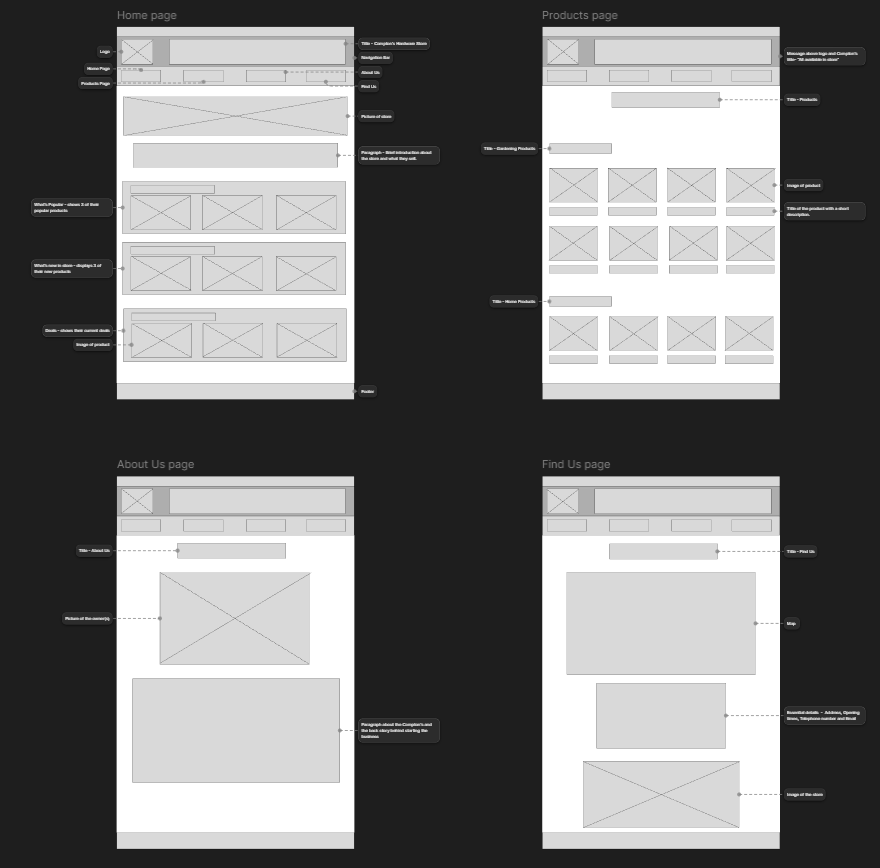
Before developing any initial design ideas, I needed to understand what Compton’s Hardware Store required from the website. This included learning about the store’s history, values, and the key message the business wanted to communicate. To do this, I conducted an interview with the owner, which was acted out by David, allowing me to ask relevant questions about the store’s goals, audience, and overall identity. The insights I gathered from this interview helped me create the website content first, which then shaped the structure and visual design of the site.
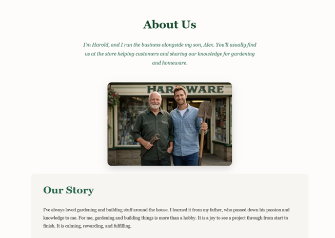
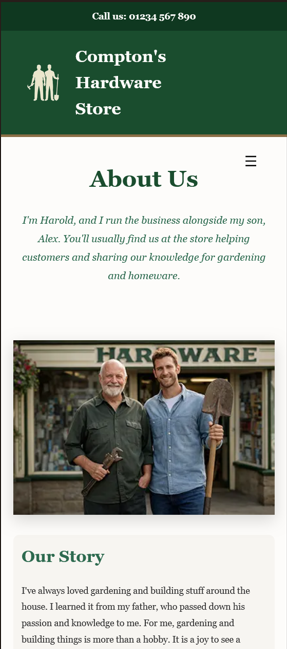
From the very start, I decided that Compton’s Hardware Store should be presented as a family-run business, operated by a father and son, Harold and Alex. I wanted the website to reflect this family narrative while also communicating that the business is experienced, friendly, and trustworthy. With these values in mind, I created content that captured the store’s personality and then mapped out how the overall layout and visual style should look. Initial wireframes were produced to plan the placement of content and ensure a logical flow before moving on to design and development.
Marketing Exploration
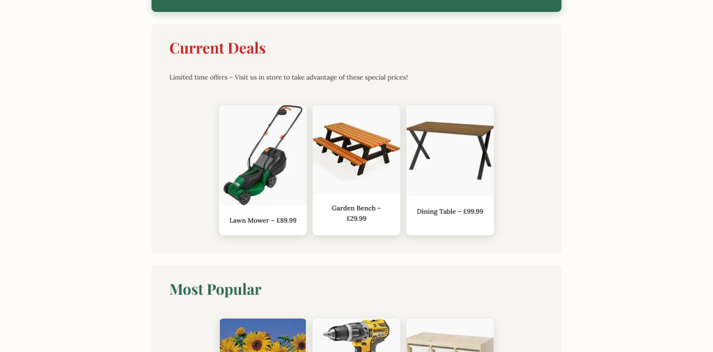
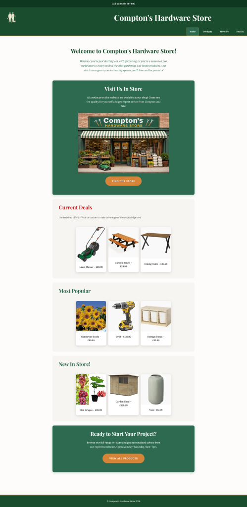
The main purpose of building the website was to increase awareness of Compton’s Hardware Store. To achieve this, I decided to focus on showcasing the physical store alongside marketing sections such as current deals, popular products, and new items in stock. By immediately presenting this information to users, the website creates a sense of excitement and encourages them to explore further. These sections help highlight the variety of products available while giving users a clear reason to visit the store in person.
Brand Image and Inspiration
The brand image of Compton’s Hardware Store is built around trust, family values, experience, and passion. To reflect this, I designed a logo featuring a silhouette of Harold and Alex holding a shovel and a hammer. This instantly communicates the type of products sold and reinforces the hands-on, practical nature of the store.

Trust was a key consideration throughout the website. On the “About Us” page, users are introduced to Harold and Alex and learn about their background and motivations. Sharing their story in this way makes the business feel more authentic and approachable, helping to build a connection with users.
Typography Exploration
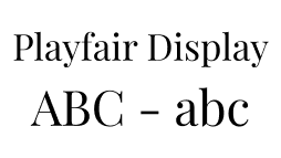
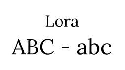
For headings (H1, H2, H3), I chose Playfair Display because it feels classic and personal, almost like Harold wrote the content himself. For the body text, I used Lora, which is very readable and pairs well with Playfair Display. Together, these fonts make the website feel friendly, approachable, and trustworthy, while keeping everything clean and easy to read.
Colour Scheme and Visual Style
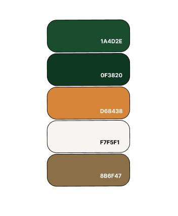
The colour scheme Green (1A4D2E), Dark Green (0F3820), Brown (8B6F47), Dark Orange (D68438) and Off-White (F7F5F1) was chosen deliberately. Green and brown evoke nature and gardening, while off-white and neutral tones are often found in modern home interiors. Then lastly for buttons I used Dark Orange so that they stand out on the page. This combination reflects the products sold and creates a calm, welcoming space. Overall, the visual style was designed to be easy on the eyes, enhance the user experience, and reflect Harold and Alex’s personalities.
Prototype and Final Design
The final prototype communicates the brand values while remaining clear, simple, and easy to navigate. This project taught me the importance of designing mobile-first. Starting with mobile layouts and then scaling up for larger screens ensured the website works smoothly across all devices.
Mobile View
Desktop View
I also gained a stronger understanding of the importance of brand identity. As a designer, it is essential to understand the message a business wants to communicate and ensure that this message is conveyed naturally through the website. Users should never feel confused about what the business represents or who it is for. The website should clearly stand for the values of the business.
Reflection
If I were to redo this project, I would experiment more with creative design choices. I could’ve explored more ways of presenting content to make the website even more visually engaging. Overall, this project showed me the importance of planning, brand storytelling, and designing with the user in mind.