Categories
Article

Understanding SVGs For The Web

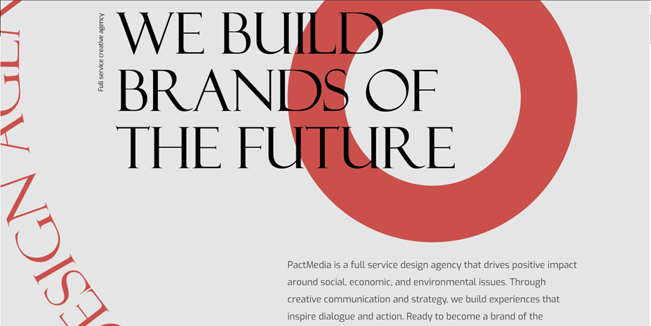
What are SVG’s and why are they useful?

SVG stands for Scalable Vector Graphics. It’s a type of graphic format widely used in web design. SVG was developed by World Wide Web Consortium – W3C between 1998 and1999. It was then created as an open-standard XML based vector image and was officially released in September 2001. SVGs are especially useful because they are scalable and lightweight which beats traditional images like JPEGSs or PNGs. The can be scaled across a wide range of dimensions without losing its quality. This is why they are great for responsive web designs, icons, logos, illustrations and interactive graphics.

SVGs use mathematical formulas to create lines, shapes, colours and paths instead of pixels, which allows the image to be sharper.

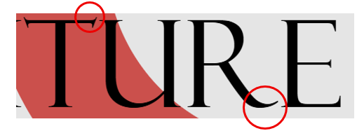
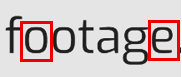
Here is a comparison between a PNG and SVG of the same image:

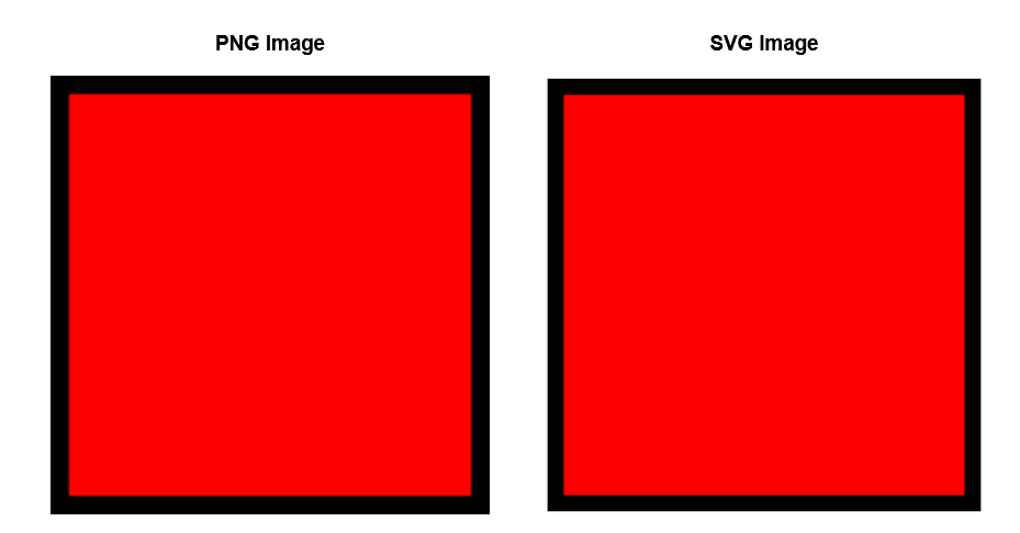
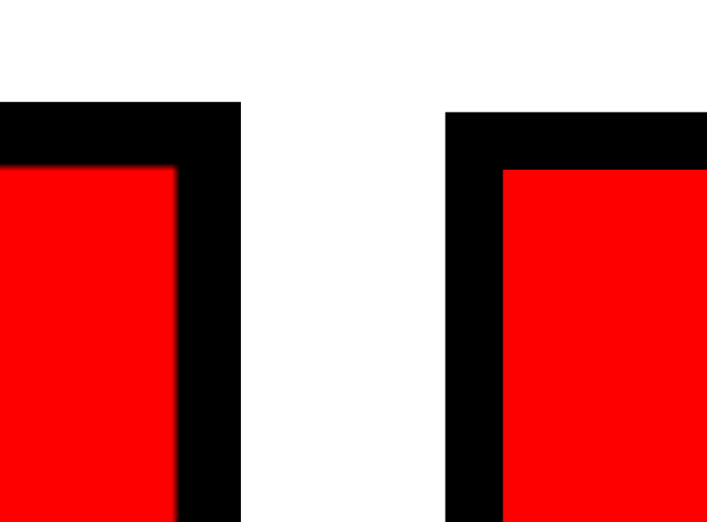
From a distance, the PNG and SVG image looks the same however when zoomed in, the PNG lines become pixelated while the SVG graphic remains sharp.

When comparing file size between the two images, the SVG file is less in size. But why does file size matter? Smaller file sizes create a better user experience. A webpage with a small file size will load faster. It also means that those with limited connectivity and are using mobile data will have less data to download. As well as this, it also improves the overall performance of the webpages.

Key benefits of SVGs:

  • Scalable: No pixelation on any screen size which allows websites to have quality images.
  • Lightweight: SVGs are often smaller in file sizes than high resolution PNGs or JPEGs
  • Editable: It can be editing in both code and design software
  • Interactive: It supports animations and CSS styling

How to Create SVGs

Here are a few ways SVGs can be created:

1. Manually writing SVG code – Its discussed in the ‘What are the various ways SVGs can be added onto webpages’ section under Inline SVGs.

2. Design tools – such as Adobe Illustrator, Figma and infinity.

Here’s a tutorial using Figma as the design tool

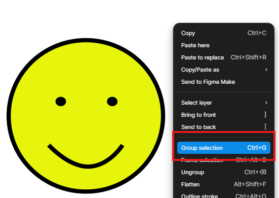
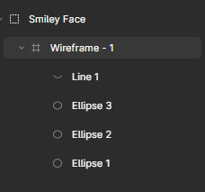
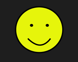
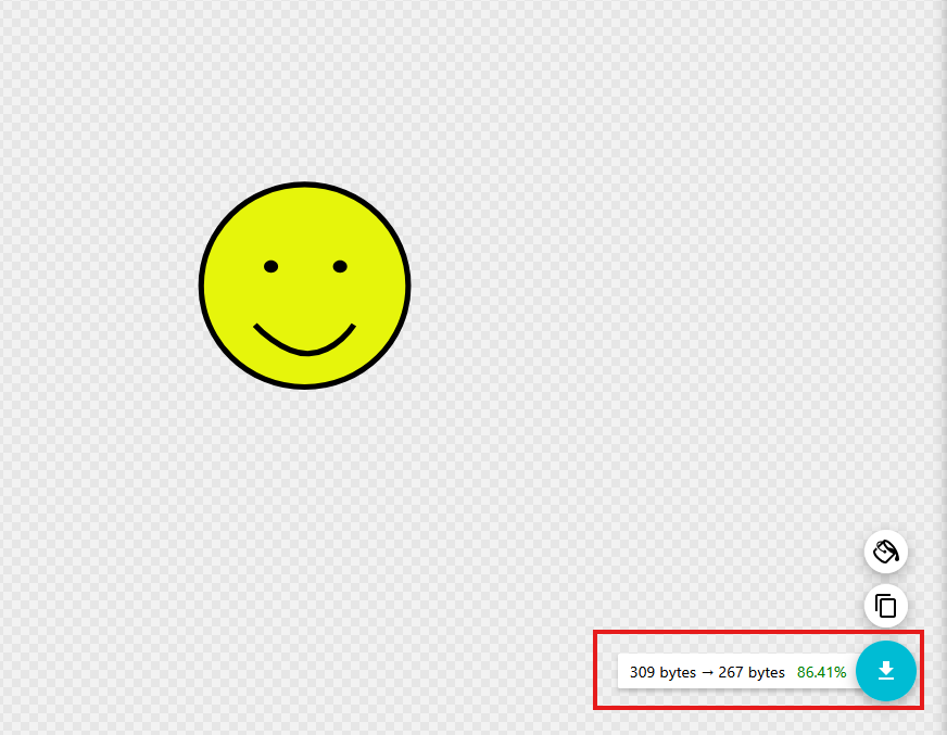
2.1. Create your shape – Here is a smiley face created in Figma using 3 cirlcles and a line.

2.2. Group your wireframe. If your SVG has many shapes and layers, this ensures that the SVG is exported as a single image.

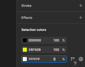
2.3. Remove the background (optional). If you don’t want your image to have a background, go selection colors. A Figma wireframe automatically comes with a white background so for the white colour (FFFFFF) change it from 100% to 0% and that should remove your background.

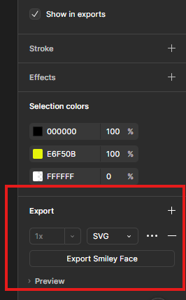
2.4. Once you are happy with your desired line or shape, go to the Export tab and click the +. Mine is set to PNG as default but we want to select SVG. Then click the Export button below, which will save your work as a SVG file.

2.5. When the file is opened, it should automatically display in the default web browser, allowing the SVG image to be viewed.

3. Converting graphics to SVG – You can also convert PNGs or JPEGs to SVG using online converter tools. However, it’s not the best practice because complex raster images may not always convert cleanly.

Here’s an example of an image that was converted from JPEG to SVG.

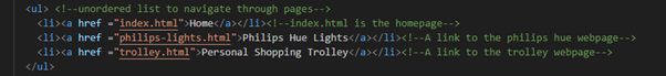
Various Ways SVGs Are Added to Webpages
Inline SVG

In HTML, SVG lines, shapes and colours can be created using code, where the position and the size of the shape is defined using x and y axis coordinates. Here are the basic shape elements that can be created:

1. An <line> element creates a straight line between two points. X1 and y1 is the starting point of the line, while x2 and y2 defines the ending point of the line. The stroke is the line colour; here it’s been set to green. And the stroke-width is the like thickness which I’ve set to 4.

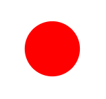
2. The <rect> element creates a rectangle. The x = horizontal position (left to right) and the y = vertical position (top to bottom). The x and y positions determines where the rectangle starts on the page. The fill attribute determines the rectangles colour, here its been set to red.

3. The <circle> element creates a circle. The  cx = centre point x axis and the cy = centre point y axis, while the r = radius. The radius determines how big the circle is. A larger radius value creates a bigger circle, and a smaller radius creates smaller circle.

4. The <ellipse> element creates an oval shape. What makes the ellipse different to a circle is the rx = horizonal radius and ry = vertical radius which will stretch the circle out. In the example, the rx is larger than ry, therefore shape will stretch horizontally.

5. The <polyline> element creates any shape made of connected straight. The points for polylines and polygons are represented in coordinate pairs. The pairs are written like this: x1, y1 x2,y2 x3,y3 x4,y4. The x value represents horizontal position, and the y value represents vertical position. In the example, there’s 4 pairings which makes 4 connected straight lines.

6. The <polygon> element is similar to <polyline>. The key difference is the polygon element automatically closes the shape, connecting the last point back to the first.

7. The <path> element is most versatile. Although SVG provides seven basic shape elements, the <path> element can create almost any vector shape, which makes it foundational to most SVG graphics used on websites.
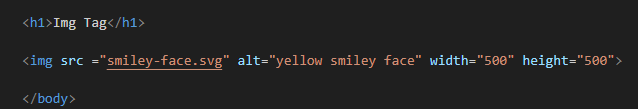
Img tag

In this case, the SVG is used as an image source file,  just like any other image on a webpage. It is important to also include a descriptive alt attribute so that those who are visually impaired can interpret the image through screen readers.

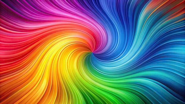
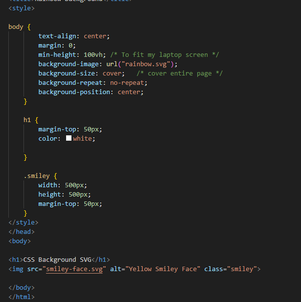
CSS Background image

In this method, the SVG is being applied though CSS instead of placing it in the HTML. In the example, the background image has been added to the body CSS. The min-height is made to fit the screen size, and the background-image loads the SVG onto the webpage. Background-size is put as cover to cover the webpage and background-repeat is to make sure the SVG is not duplicated many times across the page.

SVG Sprites

This is best for reusing SVGs multiple times across the webpage without having to rewrite the full SVG code. The SVG is defined once inside the <symbol> element and each symbol is given its own unique ID. To be able to reuse the SVG, you would use the <use> element. Its especially good for styling all the SVGs you’ve reused, at once.

Creating CSS Animated SVGs

With CSS, it can animate properties such as colours, positions, scales and rotation.
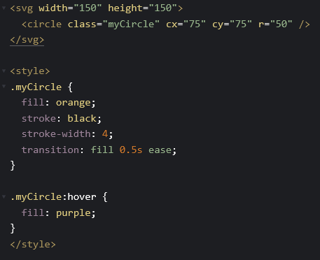
Hover Animation

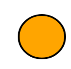
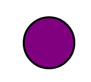
In the example below, the circle changes colour once the user hovers over it. The transition property tells the browser the way it should animate once the user hovers over it, the 0.5 ease gives it a slight delay into a smooth transition to a different colour. The MyCircle hover element is calling for the orange circle to turn purple when the user hovers over it.

Bouncing Animation

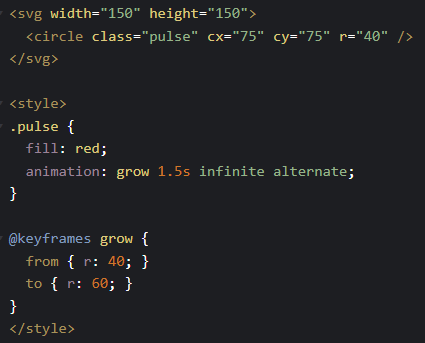
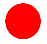
The <svg> element creates a 150×150 canvas, while the <circle> element draws a circle positioned in the centre using cx and cy. The CSS applies a keyframe animation that changes the circle’s radius from 40 to 60 pixels, causing the circle to expand and shrink repeatedly to create a pulsing effect.

How can they be optimised?

Why should we optimise our SVGs? Optimising SVGs improves the website performance and loading times which is from removing unnecessary things in the SVG.

1. SVG optimisation tools – SVGOMG. A optimisation tool like SVGOMG removes spaces, comments, layers and metadata which is not needed. By doing this, the SVG file size will be reduced.

2. Code-level optimisation – If you are manually coding your SVG image, removing line breaks, indentations and extra spaces will also help reduce the file size.

3. Simplify paths – if using a design tool to create your SVG from scratch, try reducing the amount of anchor points on your image and removing unnecessary layers. Extensive amount of anchor points and layers will make the file size bigger.

References
Categories
Uncategorized

Small Business Website Process

Beginning Ideas and Sketches

Before developing any initial design ideas, I needed to understand what Compton’s Hardware Store required from the website. This included learning about the store’s history, values, and the key message the business wanted to communicate. To do this, I conducted an interview with the owner, which was acted out by David, allowing me to ask relevant questions about the store’s goals, audience, and overall identity. The insights I gathered from this interview helped me create the website content first, which then shaped the structure and visual design of the site.

From the very start, I decided that Compton’s Hardware Store should be presented as a family-run business, operated by a father and son, Harold and Alex. I wanted the website to reflect this family narrative while also communicating that the business is experienced, friendly, and trustworthy. With these values in mind, I created content that captured the store’s personality and then mapped out how the overall layout and visual style should look. Initial wireframes were produced to plan the placement of content and ensure a logical flow before moving on to design and development.

Marketing Exploration

The main purpose of building the website was to increase awareness of Compton’s Hardware Store. To achieve this, I decided to focus on showcasing the physical store alongside marketing sections such as current deals, popular products, and new items in stock. By immediately presenting this information to users, the website creates a sense of excitement and encourages them to explore further. These sections help highlight the variety of products available while giving users a clear reason to visit the store in person.

Brand Image and Inspiration

The brand image of Compton’s Hardware Store is built around trust, family values, experience, and passion. To reflect this, I designed a logo featuring a silhouette of Harold and Alex holding a shovel and a hammer. This instantly communicates the type of products sold and reinforces the hands-on, practical nature of the store.

Trust was a key consideration throughout the website. On the “About Us” page, users are introduced to Harold and Alex and learn about their background and motivations. Sharing their story in this way makes the business feel more authentic and approachable, helping to build a connection with users.

Typography Exploration

For headings (H1, H2, H3), I chose Playfair Display because it feels classic and personal, almost like Harold wrote the content himself. For the body text, I used Lora, which is very readable and pairs well with Playfair Display. Together, these fonts make the website feel friendly, approachable, and trustworthy, while keeping everything clean and easy to read.

Colour Scheme and Visual Style

The colour scheme Green (1A4D2E), Dark Green (0F3820), Brown (8B6F47), Dark Orange (D68438) and Off-White (F7F5F1) was chosen deliberately. Green and brown evoke nature and gardening, while off-white and neutral tones are often found in modern home interiors. Then lastly for buttons I used Dark Orange so that they stand out on the page. This combination reflects the products sold and creates a calm, welcoming space. Overall, the visual style was designed to be easy on the eyes, enhance the user experience, and reflect Harold and Alex’s personalities.

Prototype and Final Design

The final prototype communicates the brand values while remaining clear, simple, and easy to navigate. This project taught me the importance of designing mobile-first. Starting with mobile layouts and then scaling up for larger screens ensured the website works smoothly across all devices.

Mobile View

Desktop View

I also gained a stronger understanding of the importance of brand identity. As a designer, it is essential to understand the message a business wants to communicate and ensure that this message is conveyed naturally through the website. Users should never feel confused about what the business represents or who it is for. The website should clearly stand for the values of the business.

Reflection

If I were to redo this project, I would experiment more with creative design choices. I could’ve explored more ways of presenting content to make the website even more visually engaging. Overall, this project showed me the importance of planning, brand storytelling, and designing with the user in mind.

Categories
Article

User Experience Design

Introduction

In November, we took part in UX design workshops led by Steph and Chris. Across the two sessions, I learned a range of research and design methods, including conducting interviews with my peers, creating user personas and wireframes, and presenting our ideas. The hands-on activities helped me gain practical experience helped prepare me for real-world UX work. The workshops were highly informative and influenced the direction of my major project.

My major project is a web-based application designed to help people regain their attention and improve their cognitive well-being in a world of unrelenting digital distractions. The basis of my project is derived from my own experiences with lack of concentration, fatigue of mind, and difficulty to sometimes maintain attention. My website is about my personal experiences with improving my cognitive well-being, and it should be understood that it is not expert-based. While documenting what worked for me, I hope to encourage users to evaluate their own attention patterns.

The purpose of this article is to act as a plan for how I will use User Experience Research and Design techniques to develop my major project. I will discuss the different research methods I will be conducting in order to build the final product. The planning phase is vital to ensure that my project continues to be user-centred, accessible, and aligns itself with the needs of individuals who are already mentally overwhelmed.

Project Overview

My goal is to develop an easy-to-use website where users can explore attention as a cognitive resource affected by today’s fast-paced digital world. In my own case, my over-stimulation was caused by excessive tech usage, which resulted with declines in reading comprehension, increased procrastination, and ongoing mental fatigue.

Therefore, I decided to develop a website that shares my personal experience, while making it clear that the ideas and techniques I present were ones that worked for me and may not be universally applicable to all. From my website, users will get to read about my experience, experiments, and soft prompts to reflect on, instead of just providing solutions to problems.

My Goals and Objectives

  • The website must provide an environment where the user does not become overwhelmed by the content of the site. Since this website is about cognitive wellness, elements on each webpage must be organised to provide a comfortable and focused learning environment.
  • The website must be easy to follow through. The user must know Where they are, What options they have and How to proceed.
  • The website must be developed with empathy, a core principle of User Experience design. By understanding users, I can create a design that supports them.
  • The website needs to be consistent. Consistency in layout, navigation and interactions will help the user feel confident using the website. When interactions are predictable, the user will not need to learn and recall unfamiliar actions.
  • The website must be tested and improved continuously. With the help of classmates, teachers, friends and family, I can receive valuable feedback and continually improve the website. Doing so will help better the usability and accessibility of the website.

User Research Methods

Competitor Analysis

As part of my planning, I researched other platforms that focused on attention, brain health and digital wellbeing so I could understand what has already been produced. I specifically looked at Lumosity, Healthybrains.org and Freedom.

The focus of Lumosity is to improve your attention by using brain training type games. The games are engaging, but they focus on performance and repetition rather than supporting meaningful development of attention. Healthybrains.org offers a lot of evidence-based information about lifestyle and brain health, and also preventative measures. However, may seem too formal to readers and can lose their attention. Freedom takes a different approach by eliminating distractions, and while this may be beneficial, it does not encourage users to reflect on the underlying reasons for their attention difficulties.

My website aims to be somewhat different from those three platforms because it will attempt be more open and honest. Instead of instructing users on what they should do, I tell them what I did and provide the opportunity for them to learn about their own attention while making it fun and informative. Hopefully, my website can create a space for users to be able to think again.

User Interviews

As part of my user experience research, I intend to interview people individually, with some being affected by some sort of cognitive or attention-based limitations. The intention of the interviews is to understand what users expect from a website focused on cognitive health and wellbeing. By understanding the user needs, it can help me implement what they are looking for.

The interviews will allow participants to express themselves freely and address specific topics relevant to my project idea. Open-ended questions will be used to encourage participants to share their views, experiences, and emotions, helping me design and build a website that is responsive to user needs. I also plan to make the interviews semi-structured because it gives me the opportunity to also ask fitting questions based on their answers.

Contextual Research

I will be researching existing ideas, models and concepts for the design and development of the website.

There are three design models I will be following in order to build a well-functioning and user-centred website:

  1. Human Centred Design Model. By following the HCD model, this ensures that I always put the users at the centre when it comes to decision making. This allows me to focus on who I’m designing my website for and why. Actively working with users throughout the development process will prevent me from building a website which is not ethical. I want to allow users to make choices and have control.
  2. Double Diamond Model. This framework will help with the way I approach problems. Discovering and Defining the problem, then Developing and Delivering a solution. These 4 stages make sure that I understand the problem before building the solution.
  3. The Iterative Design Model. This model will be beneficial when I get to the prototyping stage. I plan to test my prototype on 5 to 7 users to gather their opinions and make necessary design adjustments. As the website follows a user-centred approach, it is designed for real users rather than personal use, therefore, ongoing feedback on prototypes is essential. I plan to encourage honest feedback from user and stay open to criticism in order to make the website better. I aim for users to spot errors that I might have missed, and to help create a website that is efficient and enjoyable to use.

User Personas

User personas will allow me to think beyond my own experiences and consider how other users might interact with the website. It gives me an idea of the type of users who might use my website, so I can design it based on their lifestyle, needs, and what is currently bothering them.

I have created two user personas:

Alex – 18-25 years old – ADHD/ Neurodivergent learner

Alex struggles with attention and is interested in exploring attention-support strategies that have been effective for others. For someone like Alex, who struggles with attention, I will need to think about ways I can make information engaging on my website especially because he wants to learn. For users like Alex, one design consideration is how interface elements are positioned on each webpage.

Michelle – 30 -35 years old – Self-improvement explorer

Michelle is all about self-improvement. She’s very self-aware and feels that she can make better life choices. One of her goals is to reduce her phone use by 50%. She’s looking for alternative activities to replace her phone usage. When creating a website for someone like Michelle, I want it to be inviting and encouraging because she wants to improve herself. With Michelle in mind, greater attention would be given to the emotional tone conveyed by the website. Colour, font and layout research will be conducted because they play a factor in the way users feel when using a website.

Empathy Maps

Empathy mapping helps me to understand users’ experience rather than just assuming. Using empathy maps allows me to practice the HCD framework, as I focus on the user’s emotional needs.

I have created an empathy map for Alex to understand his perspective through what he Thinks, Needs, Feels and Says & Does.

The use of empathy mapping for Alex has influenced my design decisions. It has allowed me to think about being cautious with the wording on my site to ensure that I don’t show a sense of urgency or imply that there’s something wrong with the user. I’m planning to express the content on my site using language that encourages reflection, for example, “you may find yourself experiencing a similar situation”, which will assist with creating an emotionally safe space and will encourage the development of a calm and supportive experience.

User Journeys

Another technique that will help with my project is user journey mapping. This will give an understanding of the user’s experience when navigating the website from start to finish. Using user journeys is good for spotting pain points early, preventing myself from designing only for myself, and it gives me the opportunity to reduce cognitive load in users. It also enables me to design a user experience that acknowledges that a user’s ability to concentrate and pay attention can vary greatly, and therefore avoid creating an overwhelming website.

User journeys will be beneficial in the design and development process because I want avoid overstimulation when it comes to someone like Alex. And I want someone like Michelle to feel calm every step of the way.

The goal is for the user to have a positive and insightful experience throughout.

I’ve made a user journey map for Michelle below:

Accessibility and Inclusive Design

Accessibility is a big factor, given that the focus of the site is cognitive well-being and attention. Designing for accessibility requires me to understand that users may have ADHD, Dyslexia and/or other conditions which can impact their ability to process information.

In terms of supporting cognitive accessibility, I plan to create a clear visual hierarchy using consistent layouts and a good amount of space between the interface elements. I will make sure that animations are minimal, avoid sudden animation movements or auto-play features which can be distracting.

I plan to also choose colours that are calming in the hopes of minimising visual fatigue, yet remain readable. The language used should be simple and avoid complex definitions so that users don’t feel that the information is hard to understand.

A/B Testing

Based on the feedback and suggestions during the iteration design stage, I will create two prototypes. The iterative stage will identify usability issues to address, while A/B testing will be used to tell me which prototype version performs better functionally. I plan to ask 7 participants which prototype they like best. The prototype with the most votes will guide how the website looks and operates.

Conclusion

The user research techniques I plan to use has allowed me to think about how I can transform a personal experience about my brain health into a more thoughtful user-centred product.

What I hope out of this project is to create a website that is perceived by users as helpful. Instead of providing answers, I want the site to encourage users to consider their own brain health and figure out their next steps.

References

Categories
Uncategorized

3 Websites with good colour schemes

https://www.frame.io

Background: Deep Navy with purple and blue highlights

Text: White and Soft grey

Framer io’s colour scheme creates an exciting and modern visual experience through its deep navy background with purple and light blue highlights. The combination of white and soft grey text against the dark background gives the website good contrast, making it easy to read while giving it a clean and professional look. What stands out most is how the cool blue gradients give it a modern look, while the subtle purple tones give it a creative and futuristic look.

The palette doesn’t just look good, it also influences how we feel. Blue evokes trust and calmness. Purple suggests forward-thinking and the dark background adds sophistication. The gradient between the black and purple gives that futuristic feel so you excited going through the website.

https://orkenworld.com

Background: Orange, Black and dark grey

Text: White

ORKEN’s website (orkenworld.com) features a dark, moody colour scheme that creates an immersive and atmospheric experience, perfectly suited to its fantasy theme. The primary background is a near-black shade, providing high contrast for light text elements, which are typically in a soft grey text for readability. The website also incorporates a vibrant orange, which highlights the brand’s fantastical aesthetic. The overall palette is restrained but effective: the dark base sets a dramatic tone, the light text ensures clarity, and the metallic and orange accents provide visual interest and focus. This combination guides the user’s eye, emphasises interactive parts, and supports the storytelling.

https://slumber.fm

Background: Navy

Text: Gold

Slumber’s website uses a calm, dark colour scheme that fits its focus on relaxation and sleep. The background is a deep navy, and the text is light grey or off-white so it’s easy to read. Soft teal and green-blue accents add a gentle, soothing touch without being distracting. The colours are simple: the dark background adds depth, the light text is clear, and the muted accents guide the eye. This makes the site feel peaceful while keeping buttons and links easy to see. The colours also remind you of the night sky, which feels familiar and helps connect the design to sleep.

Categories
Homework

3 Websites With Good Typograghy

  1. Pact Media

https://pactmedia.org/

Pact Media is a full-service creative agency that helps brands stand out and deliver meaningful digital experiences. Right from the homepage, you can see their design identity shine through. It gives confident, stylish, and progressive.

The headings use the Felix serif font, which immediately gives them presence. It feels bold and confident, yet still stylish, perfectly reflecting the agency’s creative personality. The elegant but yet sharp details at the ends of letters adds sophistication, showing that Pact Media values both professionalism and creativity. It’s the kind of font that really communicates what the agency can bring to its clients.

For the paragraphs, navigation, and other text, the site uses Exo, a clean sans-serif font. Exo is easy to read, geometric, and slightly boxy. It’s clear to see that box shape when you look at the o’s, e and a.

It pairs beautifully with Felix, balancing the decorative heading with simple, readable text. Plus, there’s good line spacing making the content easy on the eyes and effortless to skim through.


2. Pixelmatters

https://www.pixelmatters.com

Pixelmatters is a digital product studio founded in Porto, Portugal, around 2013–2014. Their team is made up of strategists, designers, and developers who work together to create high-quality web and mobile experiences. Guided by their motto, Good is not good enough, Pixelmatters places a strong focus on excellence and detail in everything they build.

The website uses Geist Sans, a clean sans-serif typeface that immediately gives a sense of trust and reliability. The circular shapes of letters like p, d, b, and c create a soft and smooth appearance, making the text feel approachable and friendly. Despite its simplicity, the font also feels modern.


3. BYLD

https://www.byld.dev

byld.dev is the website for BYLD, a software agency that helps founders and teams create exceptional digital products. Their goal is to build software that businesses can trust and rely on. The site has received awards for its design, winning Best Innovation, UX, and UI at the CSS Design Awards in 2025.

The title font, Microgramma D, is known for being strikingly bold. It acts as a strong visual element for the website, immediately drawing attention. Though the designer chose to merge the letters, the boldness of this font ensures the name remains clear and readable even with the creative styling.

This typeface works best for titles and headings, especially in all caps, where its structured and confident look reinforces BYLD’s identity as a serious yet creative tech agency.

The body text uses Ticketing, a monospace font that resembles the kind of type you’d find on train or boarding tickets. Therefore, its familiar, readable, and highly functional. Each letter has the same width, giving the text a neat, code-like appearance that fits perfectly with BYLD’s tech-driven theme.
Some of the letters feature angular, hexagon-like corners, adding a unique geometric touch that makes the font feel modern and technical.

Even without reading the words, visitors can tell this company is connected to coding and digital design. Despite being in all caps, the font doesn’t feel intimidating. The clear spacing between words, prevents the text from looking crowded. The result is a layout that feels structured, futuristic, and perfectly aligned with BYLD’s brand message.

Categories
Weekly Learning

What I Learned This Week – Week 5

This week I learnt about CSS (Cascading Style Sheets), which is the presentation layer of a webpage. The term “cascading” means that CSS applies styles by following an order of priority, usually taking the last line of code applied to an element. By learning CSS, I now have a clearer understanding of how to use it to style and enhance webpages.

To use CSS, you start with a selector, which is the element you want to design. Inside curly brackets, you then add properties and values that define how the element should look. For example, color: blue; sets the text colour to blue. By experimenting with CSS on my three designed objects, I was able to change text and background colours and even add cool effects like image shadows. This showed me how CSS really brings a webpage together, making it more visually appealing.

We also looked at the work of Lynn Fisher, a very inspirational web designer. She thinks outside the box when applying CSS, which makes me want to have fun and be more creative with my own designs. While exploring, I also came across CSS Tricks, a website full of helpful examples and explanations. I’d recommend it to anyone, whether they’re just starting with CSS or already experienced.

When working with colour, I wanted to make sure my text was always easy to read against the background. I found a contrast checker website that tested whether my colour choices passed accessibility standards. It was simple to use, and I could instantly see the difference in how much clearer my text looked.

Finally, I improved the homepage of my website. At first, it looked a bit dull with just plain text links, so I added images of my three objects and linked them. This was something I hadn’t done before, but it was straightforward and it made my homepage far more attractive and engaging.

Overall, this week gave me a solid foundation in CSS, as well as the confidence to experiment with styling and design. I enjoyed seeing how small changes could make a big difference in the look and feel of my work, and I’m looking forward to building on these skills in the weeks ahead.

References:

  • https://webaim.org/resources/contrastchecker/
  • https://fonts.google.com/
  • Adding links to images

Categories
Weekly Learning

What I Learned This Week

Week 3

This week, I learned what HTML stands for — HyperText Markup Language. The HyperText part refers to the ability to create links from one page to another, while Markup describes the way users can annotate text. (Reference: HTML & CSS – John Duckett).

I also explored the Web Standards Model framework, which outlines the four layers involved in creating a webpage:

  1. Content – includes text, images, videos, and audio.
  2. Structure – defines how the content is organised.
  3. CSS – controls the appearance and presentation of the content.
  4. Behaviour – makes the webpage come alive using JavaScript.

Through using markup language, I began to understand the importance of giving meaning to text. For example, using the <h1> element defines a title, while <h2> represents a subheading. I also realised it’s essential not to guess the meaning of text when referencing a book, but to check how the content is actually structured. Additionally, I learned that <!DOCTYPE HTML> tells the browser to use the latest version of HTML.

This week’s task was to create a four-page website using only HTML. Through this, I learned how to organise files and folders so that they are clear and easy to navigate. I also practised linking pages together to make navigation accessible to the user.

During this process, I explored three types of lists for structuring links:

  • Ordered lists (<ol>) – numbered lists, often used for step-by-step instructions.
  • Unordered lists (<ul>) – bullet-point lists, which I used for my navigation menu.
  • Definition lists (<dl>) – used to define words or terms, similar to a dictionary format.
Categories
Homework

3 Good Designs- Websites

Spotify

https://open.spotify.com

Spotify is the most popular music app globally, and its success comes from a design that puts users first. It’s accessible in over 180 countries, offering one of the largest music libraries, which states clearly the idea that its ‘Music for everyone’.

Personalisation is a key part of the Spotify experience. Categories such as ‘Your Top Mixes’ and ‘Audiobooks for You’ make users feel thought about, while ‘Spotify Wrapped’ provides an annual, shareable summary of listening habits. Even the ability to adjust audio settings gives users great control, which can be especially helpful for those with hearing difficulties. These features combine to create an experience that feels tailored to each individual.

Aesthetically, Spotify keeps things clean and modern with its dark theme. Bold white headings and softer grey text stand out against the black background, which not only looks stylish but also meets WCAG accessibility standards. The layout is consistent across desktop and mobile, with a centrally placed search bar that is easy to find and familiar icons that guide navigation. Content isn’t cluttered, so users can locate what they need quickly.

Performance also plays a role in why Spotify is such a strong platform. With an excellent load time of just 1.04 seconds, music plays quickly and smoothly. Even small details, like hover animations, add to the polished and interactive experience.


Airbnb

https://www.airbnb.co.uk

Airbnb’s website is designed with clarity and ease of use in mind. Navigation is straightforward, with the most important options (Homes, Experiences, and Services) placed at the top and centered. Right below, users can enter their location, dates, and number of guests, making it simple to start a search. The design remains consistent when browsing different homes or apartments, which gives the platform a reliable and professional feel.

The layout prioritizes what matters most to users. Ratings are displayed in the largest font size, since reviews are a key part of decision-making when choosing a place to stay. Categories are also clearly organized by location, allowing users to explore options across the world with ease. A clean colour palette of white, pink, grey, and black gives the site a modern and welcoming look.

Accessibility is another strength. There is an option to change the language, which makes the platform inclusive for a global audience. The price filter is also a user-centered tool, allowing visitors to adjust their budget through a clear interactive slider or by entering exact amounts. Results update in real time, giving a transparent and stress-free search experience. Another thoughtful feature is the ability to “heart” homes. This saves listings into a wishlist, making it easy to compare options later or share them with others when planning a trip.


Bang-Olufsen

https://www.bang-olufsen.com/en/gb

Bang & Olufsen’s website represents luxury and sophistication through both design and usability. The navigation is simple and clear, with categories such as ‘Speakers, Headphones, Soundbars, Televisions, and Accessories’ laid out in a user-friendly way. The minimalist aesthetic, built on neutral tones of white, cream, and black, which compliments the brand’s products.

Imagery is central to the site’s design. High-resolution photos show the products in detail, which makes the products seem to be of high quality. The hover feature is great for usability: for example, a product like headphones is first shown on its own, then on a model when hovered over. This small interaction saves users from questioning how an item might look in real life, making the process smoother and more engaging.

The brand also integrates personalisation in a unique and creative way. Through the “Build Your Own” function, users can design and customize their products. The site even addresses them as ‘The Composer’, giving a sense of ownership and importance. Real-time animations and 3D views allow users to rotate products and instantly see adjustments in colour or features.

With its strong use of whitespace, quality animations, and storytelling visuals, Bang & Olufsen’s website creates a experience that reflects elegance, quality, and amazing attention to detail.

Categories
Article

3 Good Designs- Objects

The Flash Mop

The Flash Mop is a well-thought-out cleaning tool that combines sleek design, practicality, and ease of use, making it a standout alternative to the traditional mop and bucket. Its modern aesthetic, with purple and grey tones, feels gender-neutral and stylish while being slim enough to fit into tight spaces. The overall look updates the outdated mop-and-bucket style, aligning with the brand’s promise of “Flash” by allowing users to clean both faster and more effectively.

One of the mop’s biggest benefits is its efficiency. Unlike conventional mops, there’s no need to fill and empty a heavy bucket of water. Instead, it features a built-in cleaning solution bottle that sprays the floor with the press of a button. This saves water and reduces mess, while the bottle’s design ensures no leaks, even when turned upside down. The solution can only be released when attached to the mop and activated, eliminating the risk of spillage. The reusable cleaning pads add to the sustainability and convenience, as they can be easily washed and reused. The mop is lightweight, easy to carry, and prevents the common struggles of rinsing and squeezing associated with traditional mops.

When it comes to usability, the Flash Mop is designed with comfort and accessibility in mind. The handle dotted indents for a secure hold, while its curve fits naturally in the hand. The rubber at the end of the handle allows the mop to rest against the wall without falling. The spray button is large and accessible to different hand sizes, positioned so the index finger can press it comfortably. Its height suits a range of users, meaning cleaning doesn’t involve awkward bending or stretching. Altogether, the Flash Mop delivers speed, effectiveness, and ease, making it great for everyday cleaning.


Philips Hue Lights

The Philips Hue lights are a prime example of modern, user-centered design that incorporates functionality, accessibility, and aesthetics. The product is a modern take on the traditional light switch, offering a remote with clear icons that users can instantly recognise. Its lightweight and minimal design ensures ease of use, while the magnetic feature allows the remote to stay on its base, prevents the chances of it being misplaced. Because its magnetic, users don’t always need to hold the remote in hand when adjusting the lights.

One of the greatest benefits of Philips Hue is its flexibility. Users can control the lights not only with the remote but also with their phone, voice commands, or even set schedules. This is especially helpful for those with mobility issues, as lights can be adjusted without physically reaching a switch.

Personalisation is another key benefit. Users can set custom scenes and colours to match their mood, whether it’s “Energising brightness” for the morning or a “Night light” to prepare for sleep. Features like “Reading” mode help reduce eye strain, making the lights both practical and health conscious.

Screenshot

In terms of usability, the system is designed to be simple and accessible for a wide range of users. The app and remote are straightforward, ensuring that people of all ages and abilities can use them with ease. By giving control back to the user and allowing a variety of experiences, Philips Hue demonstrates how thoughtful design can make everyday living more enjoyable.


Personal Shopping Trolley

The personal shopping trolley is a clever design that combines practicality, comfort, and sustainability. Unlike carrying multiple plastic bags, a trolley allows users to transport 20–30 kilograms of shopping in one go, which is roughly three to five bags’ worth. It has a hard board at the bottom provides which strength and stability, so heavy items can be stored securely. The bag’s material is waterproof, washable, and hard tear, making it perfect for everyday use while also reducing reliance on plastic bags which is harmful to the environment.

A key reason for the trolley’s popularity is how it supports users with different levels of strength and mobility. It is particularly most used by the elderly, as it reduces strain on the body, but this also makes it practical for anyone looking for a more comfortable way to transport shopping.

In terms of usability, the design has been carefully thought out. The large wheels make it easy to move across pavements, curbs, or even stairs, without putting pressure on the arms and shoulders. The metal handle is sturdy and fitted with a foam grip, which adds comfort and prevents the discomfort of touching cold or hot metal in different weathers. The fastening string secures items inside the bag, preventing them from falling out, while side pockets provide space for smaller belongings such as keys, wallets, or phones. When not in use, the trolley can be folded flat, making it easy to store in a small space.

By combining strength, ease of movement, and thoughtful features, the personal shopping trolley is a well-designed product that makes everyday life more manageable.