Categories
Homework

3 Websites With Good Typograghy

  1. Pact Media

https://pactmedia.org/

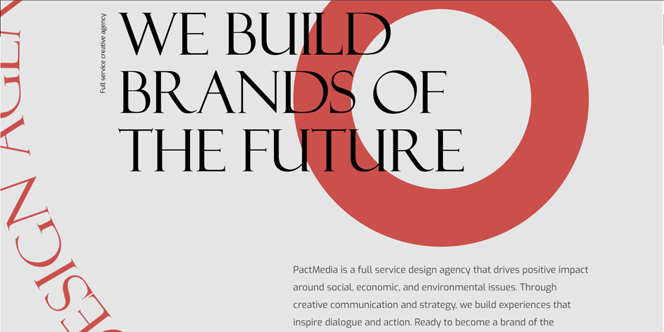
Pact Media is a full-service creative agency that helps brands stand out and deliver meaningful digital experiences. Right from the homepage, you can see their design identity shine through. It gives confident, stylish, and progressive.

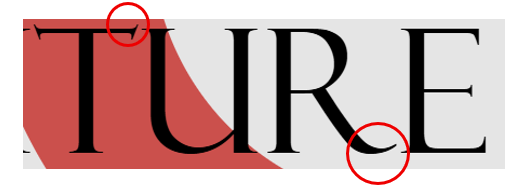
The headings use the Felix serif font, which immediately gives them presence. It feels bold and confident, yet still stylish, perfectly reflecting the agency’s creative personality. The elegant but yet sharp details at the ends of letters adds sophistication, showing that Pact Media values both professionalism and creativity. It’s the kind of font that really communicates what the agency can bring to its clients.

For the paragraphs, navigation, and other text, the site uses Exo, a clean sans-serif font. Exo is easy to read, geometric, and slightly boxy. It’s clear to see that box shape when you look at the o’s, e and a.

It pairs beautifully with Felix, balancing the decorative heading with simple, readable text. Plus, there’s good line spacing making the content easy on the eyes and effortless to skim through.


2. Pixelmatters

https://www.pixelmatters.com

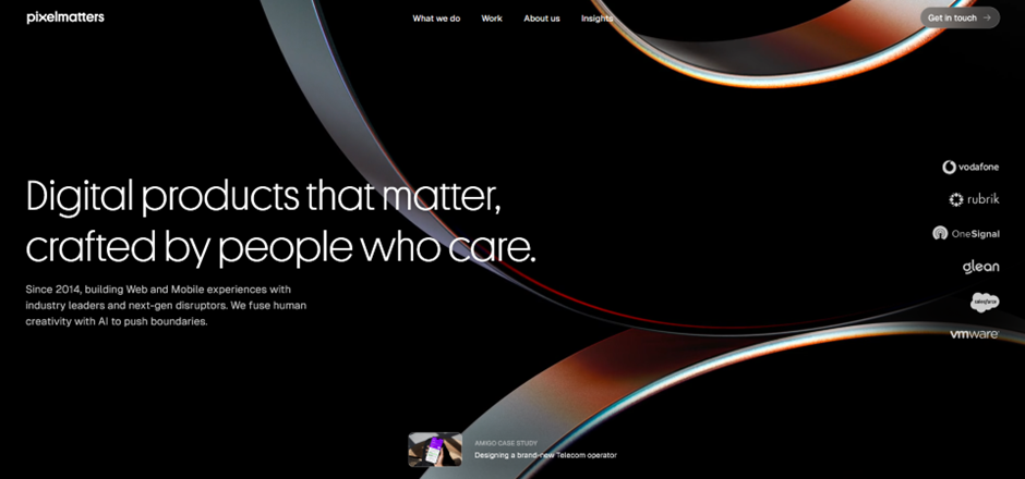
Pixelmatters is a digital product studio founded in Porto, Portugal, around 2013–2014. Their team is made up of strategists, designers, and developers who work together to create high-quality web and mobile experiences. Guided by their motto, Good is not good enough, Pixelmatters places a strong focus on excellence and detail in everything they build.

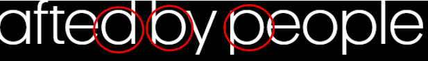
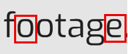
The website uses Geist Sans, a clean sans-serif typeface that immediately gives a sense of trust and reliability. The circular shapes of letters like p, d, b, and c create a soft and smooth appearance, making the text feel approachable and friendly. Despite its simplicity, the font also feels modern.


3. BYLD

https://www.byld.dev

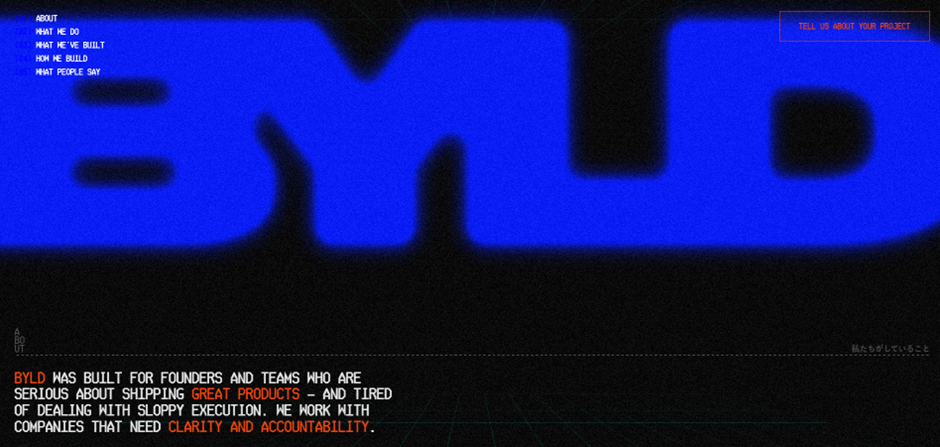
byld.dev is the website for BYLD, a software agency that helps founders and teams create exceptional digital products. Their goal is to build software that businesses can trust and rely on. The site has received awards for its design, winning Best Innovation, UX, and UI at the CSS Design Awards in 2025.

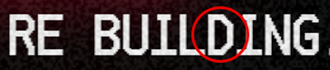
The title font, Microgramma D, is known for being strikingly bold. It acts as a strong visual element for the website, immediately drawing attention. Though the designer chose to merge the letters, the boldness of this font ensures the name remains clear and readable even with the creative styling.

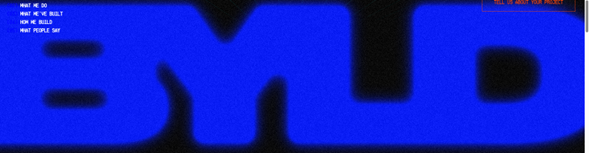
This typeface works best for titles and headings, especially in all caps, where its structured and confident look reinforces BYLD’s identity as a serious yet creative tech agency.

The body text uses Ticketing, a monospace font that resembles the kind of type you’d find on train or boarding tickets. Therefore, its familiar, readable, and highly functional. Each letter has the same width, giving the text a neat, code-like appearance that fits perfectly with BYLD’s tech-driven theme.
Some of the letters feature angular, hexagon-like corners, adding a unique geometric touch that makes the font feel modern and technical.

Even without reading the words, visitors can tell this company is connected to coding and digital design. Despite being in all caps, the font doesn’t feel intimidating. The clear spacing between words, prevents the text from looking crowded. The result is a layout that feels structured, futuristic, and perfectly aligned with BYLD’s brand message.

Categories
Homework

3 Good Designs- Websites

Spotify

https://open.spotify.com

Spotify is the most popular music app globally, and its success comes from a design that puts users first. It’s accessible in over 180 countries, offering one of the largest music libraries, which states clearly the idea that its ‘Music for everyone’.

Personalisation is a key part of the Spotify experience. Categories such as ‘Your Top Mixes’ and ‘Audiobooks for You’ make users feel thought about, while ‘Spotify Wrapped’ provides an annual, shareable summary of listening habits. Even the ability to adjust audio settings gives users great control, which can be especially helpful for those with hearing difficulties. These features combine to create an experience that feels tailored to each individual.

Aesthetically, Spotify keeps things clean and modern with its dark theme. Bold white headings and softer grey text stand out against the black background, which not only looks stylish but also meets WCAG accessibility standards. The layout is consistent across desktop and mobile, with a centrally placed search bar that is easy to find and familiar icons that guide navigation. Content isn’t cluttered, so users can locate what they need quickly.

Performance also plays a role in why Spotify is such a strong platform. With an excellent load time of just 1.04 seconds, music plays quickly and smoothly. Even small details, like hover animations, add to the polished and interactive experience.


Airbnb

https://www.airbnb.co.uk

Airbnb’s website is designed with clarity and ease of use in mind. Navigation is straightforward, with the most important options (Homes, Experiences, and Services) placed at the top and centered. Right below, users can enter their location, dates, and number of guests, making it simple to start a search. The design remains consistent when browsing different homes or apartments, which gives the platform a reliable and professional feel.

The layout prioritizes what matters most to users. Ratings are displayed in the largest font size, since reviews are a key part of decision-making when choosing a place to stay. Categories are also clearly organized by location, allowing users to explore options across the world with ease. A clean colour palette of white, pink, grey, and black gives the site a modern and welcoming look.

Accessibility is another strength. There is an option to change the language, which makes the platform inclusive for a global audience. The price filter is also a user-centered tool, allowing visitors to adjust their budget through a clear interactive slider or by entering exact amounts. Results update in real time, giving a transparent and stress-free search experience. Another thoughtful feature is the ability to “heart” homes. This saves listings into a wishlist, making it easy to compare options later or share them with others when planning a trip.


Bang-Olufsen

https://www.bang-olufsen.com/en/gb

Bang & Olufsen’s website represents luxury and sophistication through both design and usability. The navigation is simple and clear, with categories such as ‘Speakers, Headphones, Soundbars, Televisions, and Accessories’ laid out in a user-friendly way. The minimalist aesthetic, built on neutral tones of white, cream, and black, which compliments the brand’s products.

Imagery is central to the site’s design. High-resolution photos show the products in detail, which makes the products seem to be of high quality. The hover feature is great for usability: for example, a product like headphones is first shown on its own, then on a model when hovered over. This small interaction saves users from questioning how an item might look in real life, making the process smoother and more engaging.

The brand also integrates personalisation in a unique and creative way. Through the “Build Your Own” function, users can design and customize their products. The site even addresses them as ‘The Composer’, giving a sense of ownership and importance. Real-time animations and 3D views allow users to rotate products and instantly see adjustments in colour or features.

With its strong use of whitespace, quality animations, and storytelling visuals, Bang & Olufsen’s website creates a experience that reflects elegance, quality, and amazing attention to detail.