Categories
Homework

3 Good Designs- Websites

Spotify

https://open.spotify.com

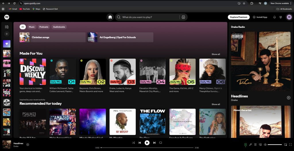
Spotify is the most popular music app globally, and its success comes from a design that puts users first. It’s accessible in over 180 countries, offering one of the largest music libraries, which states clearly the idea that its ‘Music for everyone’.

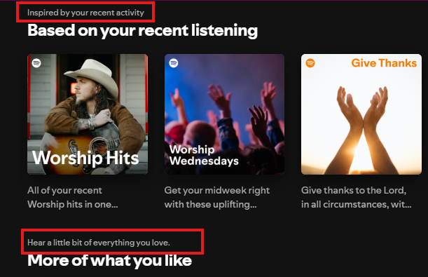
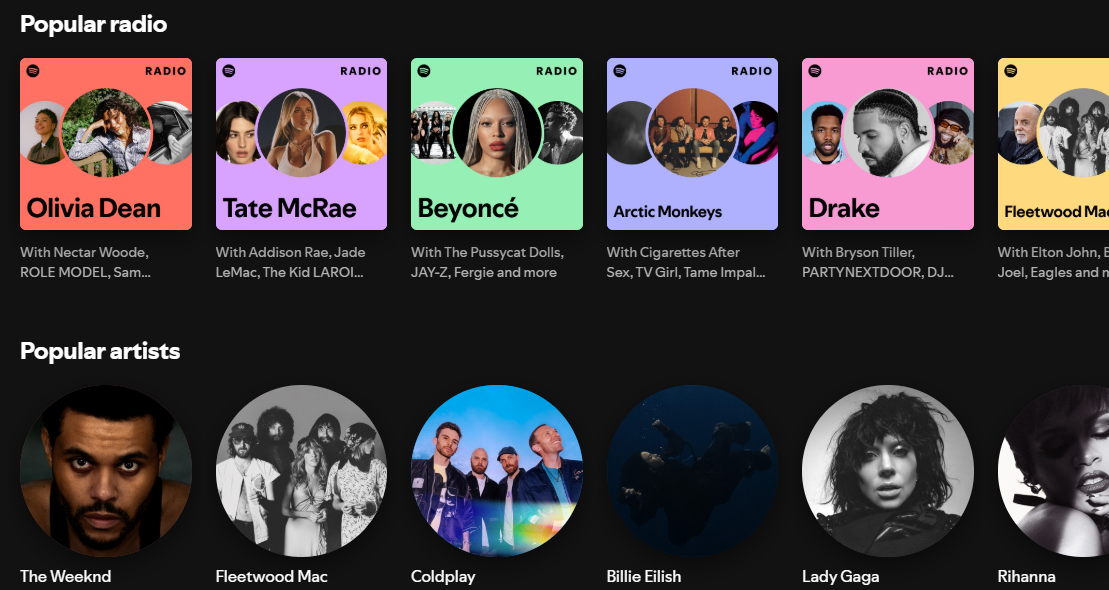
Personalisation is a key part of the Spotify experience. Categories such as ‘Your Top Mixes’ and ‘Audiobooks for You’ make users feel thought about, while ‘Spotify Wrapped’ provides an annual, shareable summary of listening habits. Even the ability to adjust audio settings gives users great control, which can be especially helpful for those with hearing difficulties. These features combine to create an experience that feels tailored to each individual.

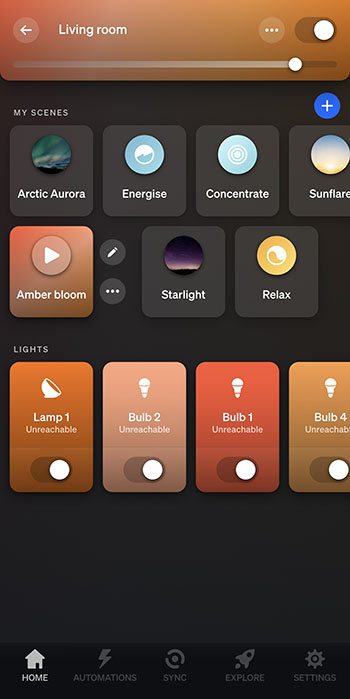
Aesthetically, Spotify keeps things clean and modern with its dark theme. Bold white headings and softer grey text stand out against the black background, which not only looks stylish but also meets WCAG accessibility standards. The layout is consistent across desktop and mobile, with a centrally placed search bar that is easy to find and familiar icons that guide navigation. Content isn’t cluttered, so users can locate what they need quickly.

Performance also plays a role in why Spotify is such a strong platform. With an excellent load time of just 1.04 seconds, music plays quickly and smoothly. Even small details, like hover animations, add to the polished and interactive experience.


Airbnb

https://www.airbnb.co.uk

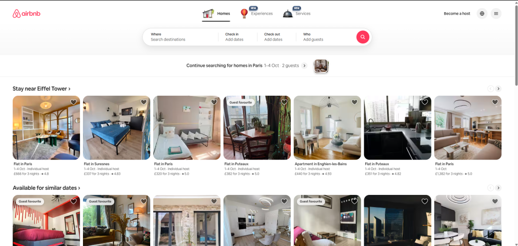
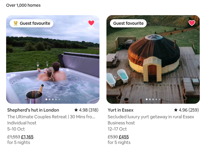
Airbnb’s website is designed with clarity and ease of use in mind. Navigation is straightforward, with the most important options (Homes, Experiences, and Services) placed at the top and centered. Right below, users can enter their location, dates, and number of guests, making it simple to start a search. The design remains consistent when browsing different homes or apartments, which gives the platform a reliable and professional feel.

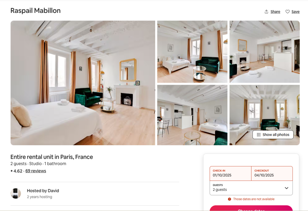
The layout prioritizes what matters most to users. Ratings are displayed in the largest font size, since reviews are a key part of decision-making when choosing a place to stay. Categories are also clearly organized by location, allowing users to explore options across the world with ease. A clean colour palette of white, pink, grey, and black gives the site a modern and welcoming look.

Accessibility is another strength. There is an option to change the language, which makes the platform inclusive for a global audience. The price filter is also a user-centered tool, allowing visitors to adjust their budget through a clear interactive slider or by entering exact amounts. Results update in real time, giving a transparent and stress-free search experience. Another thoughtful feature is the ability to “heart” homes. This saves listings into a wishlist, making it easy to compare options later or share them with others when planning a trip.


Bang-Olufsen

https://www.bang-olufsen.com/en/gb

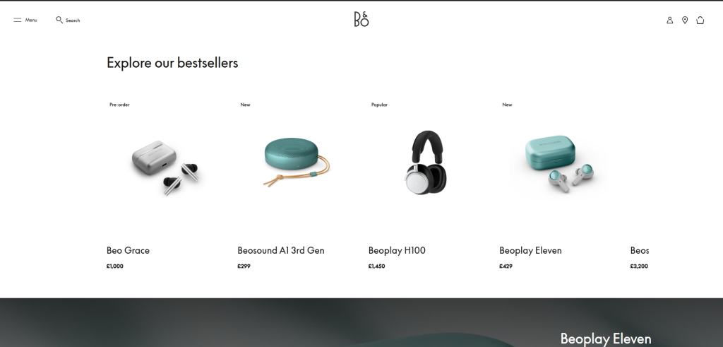
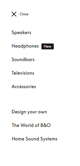
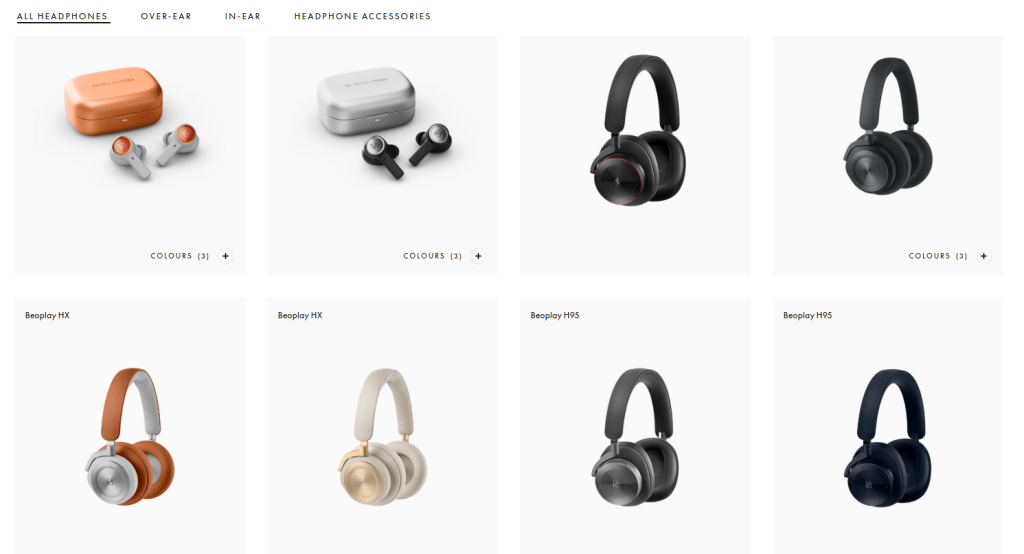
Bang & Olufsen’s website represents luxury and sophistication through both design and usability. The navigation is simple and clear, with categories such as ‘Speakers, Headphones, Soundbars, Televisions, and Accessories’ laid out in a user-friendly way. The minimalist aesthetic, built on neutral tones of white, cream, and black, which compliments the brand’s products.

Imagery is central to the site’s design. High-resolution photos show the products in detail, which makes the products seem to be of high quality. The hover feature is great for usability: for example, a product like headphones is first shown on its own, then on a model when hovered over. This small interaction saves users from questioning how an item might look in real life, making the process smoother and more engaging.

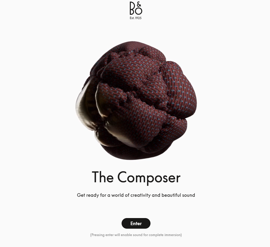
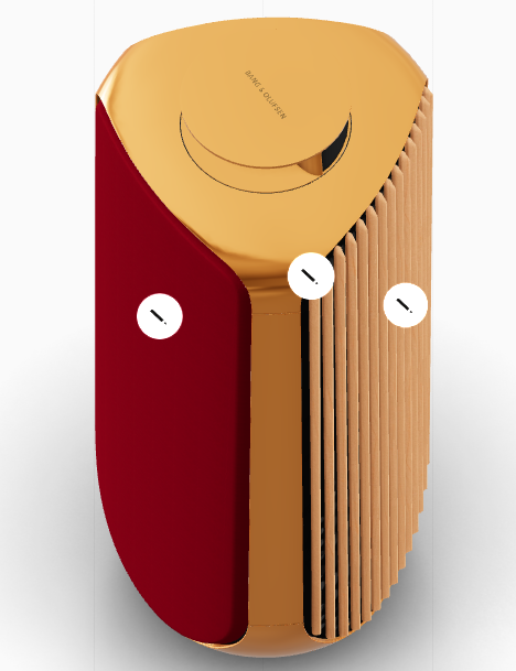
The brand also integrates personalisation in a unique and creative way. Through the “Build Your Own” function, users can design and customize their products. The site even addresses them as ‘The Composer’, giving a sense of ownership and importance. Real-time animations and 3D views allow users to rotate products and instantly see adjustments in colour or features.

With its strong use of whitespace, quality animations, and storytelling visuals, Bang & Olufsen’s website creates a experience that reflects elegance, quality, and amazing attention to detail.

Categories
Article

3 Good Designs- Objects

The Flash Mop

The Flash Mop is a well-thought-out cleaning tool that combines sleek design, practicality, and ease of use, making it a standout alternative to the traditional mop and bucket. Its modern aesthetic, with purple and grey tones, feels gender-neutral and stylish while being slim enough to fit into tight spaces. The overall look updates the outdated mop-and-bucket style, aligning with the brand’s promise of “Flash” by allowing users to clean both faster and more effectively.

One of the mop’s biggest benefits is its efficiency. Unlike conventional mops, there’s no need to fill and empty a heavy bucket of water. Instead, it features a built-in cleaning solution bottle that sprays the floor with the press of a button. This saves water and reduces mess, while the bottle’s design ensures no leaks, even when turned upside down. The solution can only be released when attached to the mop and activated, eliminating the risk of spillage. The reusable cleaning pads add to the sustainability and convenience, as they can be easily washed and reused. The mop is lightweight, easy to carry, and prevents the common struggles of rinsing and squeezing associated with traditional mops.

When it comes to usability, the Flash Mop is designed with comfort and accessibility in mind. The handle dotted indents for a secure hold, while its curve fits naturally in the hand. The rubber at the end of the handle allows the mop to rest against the wall without falling. The spray button is large and accessible to different hand sizes, positioned so the index finger can press it comfortably. Its height suits a range of users, meaning cleaning doesn’t involve awkward bending or stretching. Altogether, the Flash Mop delivers speed, effectiveness, and ease, making it great for everyday cleaning.


Philips Hue Lights

The Philips Hue lights are a prime example of modern, user-centered design that incorporates functionality, accessibility, and aesthetics. The product is a modern take on the traditional light switch, offering a remote with clear icons that users can instantly recognise. Its lightweight and minimal design ensures ease of use, while the magnetic feature allows the remote to stay on its base, prevents the chances of it being misplaced. Because its magnetic, users don’t always need to hold the remote in hand when adjusting the lights.

One of the greatest benefits of Philips Hue is its flexibility. Users can control the lights not only with the remote but also with their phone, voice commands, or even set schedules. This is especially helpful for those with mobility issues, as lights can be adjusted without physically reaching a switch.

Personalisation is another key benefit. Users can set custom scenes and colours to match their mood, whether it’s “Energising brightness” for the morning or a “Night light” to prepare for sleep. Features like “Reading” mode help reduce eye strain, making the lights both practical and health conscious.

Screenshot

In terms of usability, the system is designed to be simple and accessible for a wide range of users. The app and remote are straightforward, ensuring that people of all ages and abilities can use them with ease. By giving control back to the user and allowing a variety of experiences, Philips Hue demonstrates how thoughtful design can make everyday living more enjoyable.


Personal Shopping Trolley

The personal shopping trolley is a clever design that combines practicality, comfort, and sustainability. Unlike carrying multiple plastic bags, a trolley allows users to transport 20–30 kilograms of shopping in one go, which is roughly three to five bags’ worth. It has a hard board at the bottom provides which strength and stability, so heavy items can be stored securely. The bag’s material is waterproof, washable, and hard tear, making it perfect for everyday use while also reducing reliance on plastic bags which is harmful to the environment.

A key reason for the trolley’s popularity is how it supports users with different levels of strength and mobility. It is particularly most used by the elderly, as it reduces strain on the body, but this also makes it practical for anyone looking for a more comfortable way to transport shopping.

In terms of usability, the design has been carefully thought out. The large wheels make it easy to move across pavements, curbs, or even stairs, without putting pressure on the arms and shoulders. The metal handle is sturdy and fitted with a foam grip, which adds comfort and prevents the discomfort of touching cold or hot metal in different weathers. The fastening string secures items inside the bag, preventing them from falling out, while side pockets provide space for smaller belongings such as keys, wallets, or phones. When not in use, the trolley can be folded flat, making it easy to store in a small space.

By combining strength, ease of movement, and thoughtful features, the personal shopping trolley is a well-designed product that makes everyday life more manageable.